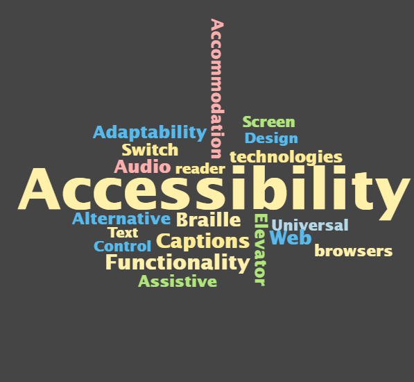
I have spend my life thus far as an able-bodied person and I know I have been unaware of many things in the world that block accessibility. The concept of designing for all from the beginning is an essential concept that everyone should be using. This concept is commonly represented by the Universal Design/for Learning. In UDL the concepts centers around the idea that if you create something and build in accessibility, what will benefit one person will likely benefit others. For example, if you build a ramp to allow for accessibility of people with a wheelchair, that ramp will also benefit people with strollers, people who struggle to walk, or just utilized by someone who is tired that day and finds the ramp easier than stairs. This is why it is so important to create content on our websites and in education that is accessible to all and allow open access so that everyone is able to access what they need to successfully engage.
When visiting Kim Ashbourne’s blog I found a wonderful blog post in her FAQ section talking about making your WordPress site accessible. I really appreciated her guidance and clear steps on how to ensure you are not only choosing accessible themes, but that you are also creating content that does not block the accessibility of the content.
In addition to sharing what I learned, I want to share an experience I had that opened my eyes to how important it is for us to understand what accessible access means and what it looks like. I have always loved fancy fonts and scripts have often been my go to for anything that I wanted to look pretty. I was designing a poster for the studio I work at and I sent it to my sister to get some feedback on the design. My sister has had a few bad concussions from car accidents and now lives with a brain injury that greatly affects her life and brain function. She sent me a message with feedback on things I wasn’t expecting and I needed to take some time to think about it and reflect to fully understand. She told me the font was very hard for her to read with her brain injury and that some of the font was too small for her. She also gave me some feedback on the colour combinations and how they were making it harder for her to read the text. I really liked making pretty and fancy posters because to me they looked really great, but I didn’t consider my audience, or at least not my full audience, and I realized that it wouldn’t matter how pretty I made it, if it wasn’t accessible it wasn’t doing its job to the fullest, nor was I. I changed the things my sister suggested to change and my poster still looked great, but it was now accessible to more people. That was a really important lesson I learned and I do my best to bring that learning to all aspects of my life. I will make mistakes, but it important to be open to receiving feedback and continue to learn.